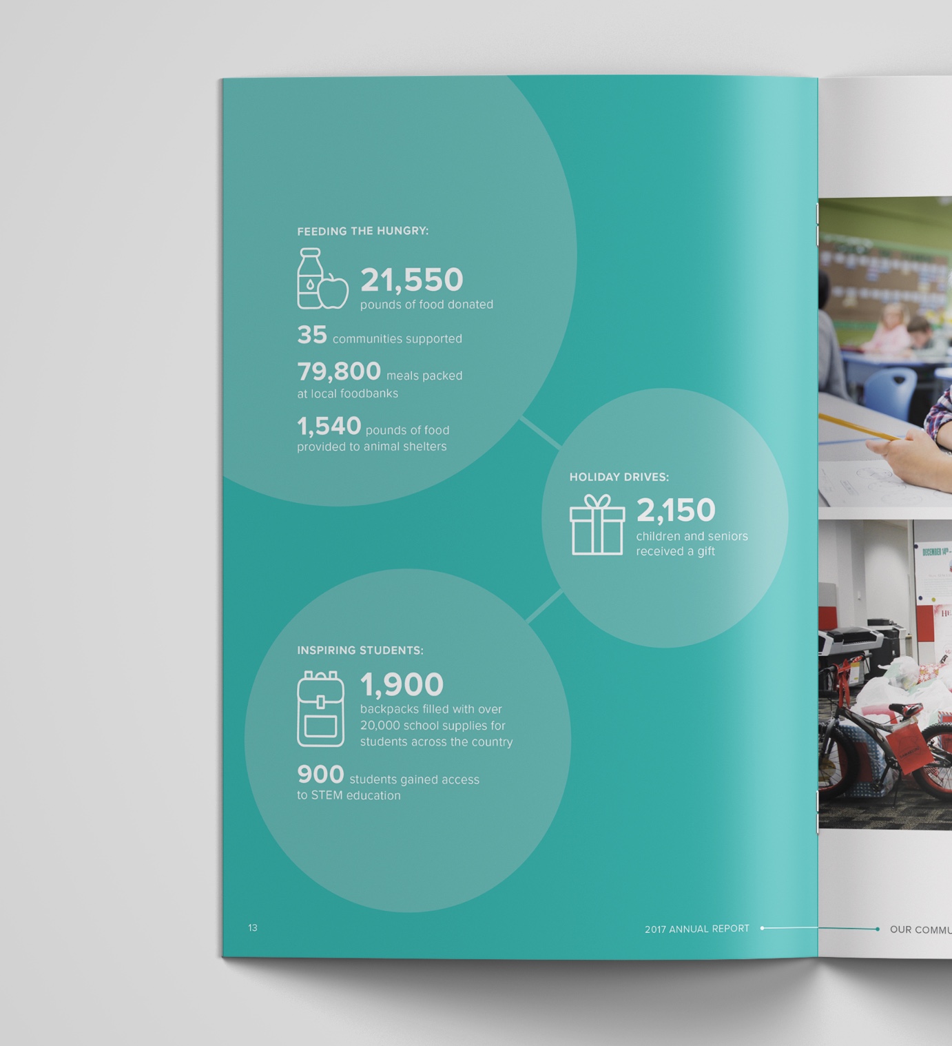
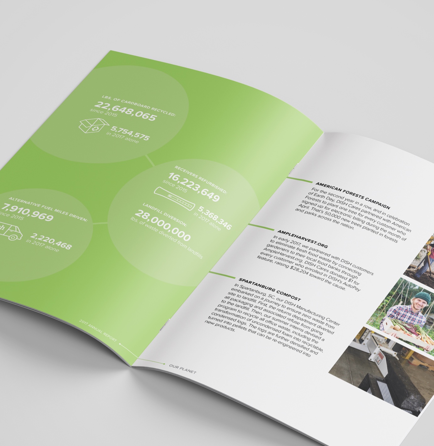
Showing a TV Provider’s Commitment to Making a Positive Impact

DISH Cares, the corporate citizenship program of DISH Network, puts together a yearly report to highlight the impact of their employee volunteering events, community engagement, and sustainable business practices. This booklet was displayed at DISH’s annual trade show to create awareness and encourage authorized retailers to become involved in their own communities.
A Connectivity Company
The DISH Cares marketing team approached our in-house design agency to design this booklet revolving around the theme of “connectivity”. The result is a design that hints at interpersonal connections and DISH’s company vision of technology changing the way the world communicates.
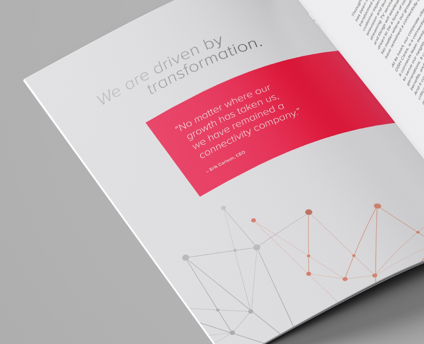
Creating a Unified Design
The biggest challenge was keeping the overarching DISH brand in mind while incorporating DISH Cares, which has its own colors and icon style used on flyers, T-shirts, and other marketing material.
The introduction uses the DISH Network brand colors, and the three subsequent sections use DISH Cares colors and icons that distinguish the three sections of the report.
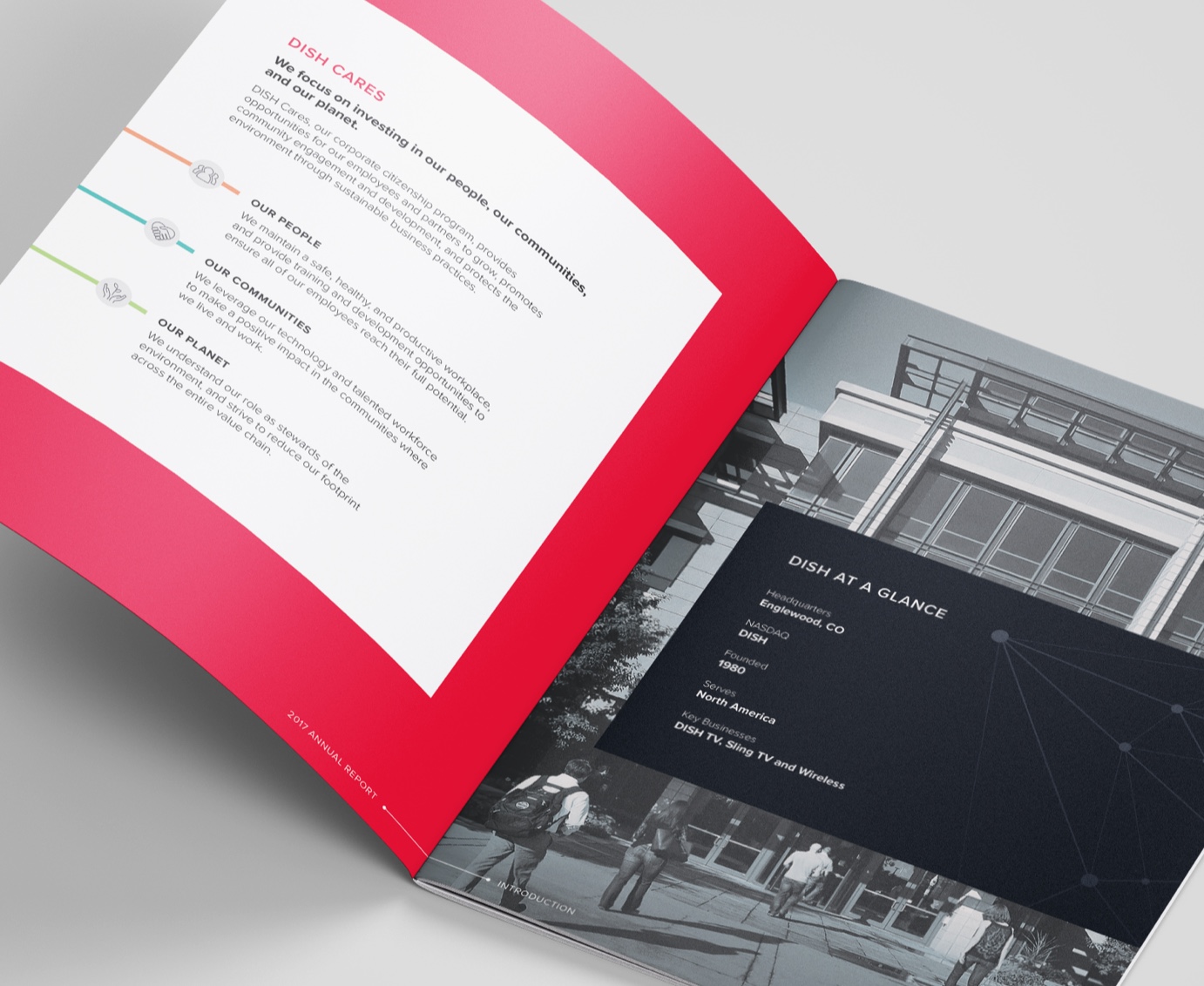
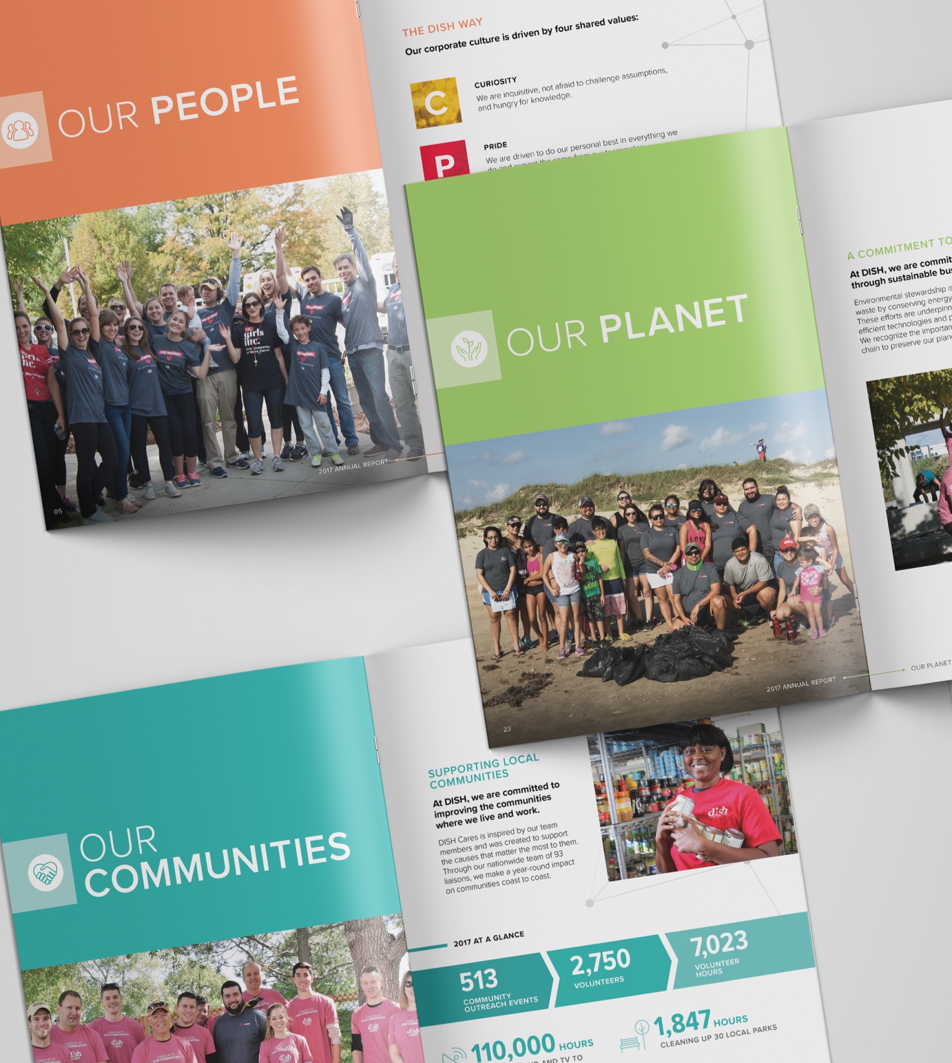
Each section intro with their designated color
Consistency in how I treated typography, design elements, and icons helped the three distinctly colored sections to still feel like they all belonged in the same report.
By using bold colors, highlighting important statistics, and incorporating photography throughout, the report provides a lot of information while being easy to scan in a trade show setting.

