Designing a Responsive Website and Cohesive Personal Brand
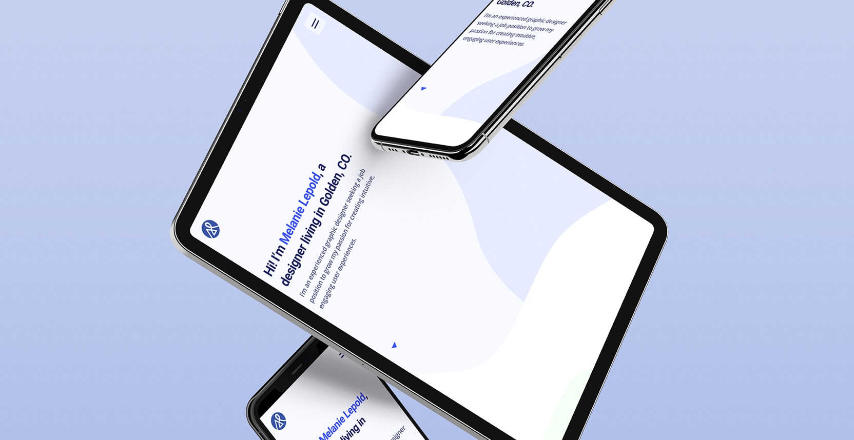
The goal of this portfolio design was to have an effective way to showcase my design work, as well as create a personal brand that maintains a consistent visual language across my website and any print materials.
Logo Design
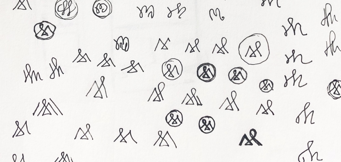
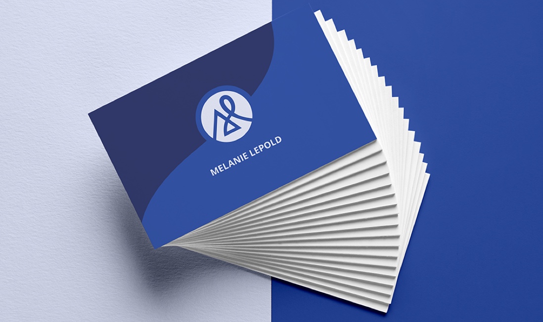
The first step of my portfolio design was to create my logo. My initial idea was an abstract ’M’ for my name, but I also wanted it to reflect my personality. The final logo represents that I take on design challenges and enjoy a design process that is a balance between structured and free-flowing.

Portfolio Website Design
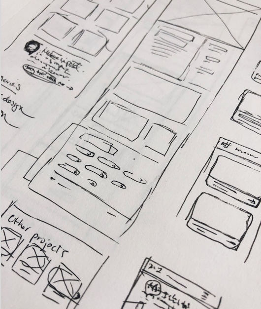
After some sketching to work through ideas quickly, I moved onto a wireframe of the layout I felt was strongest.
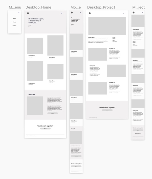
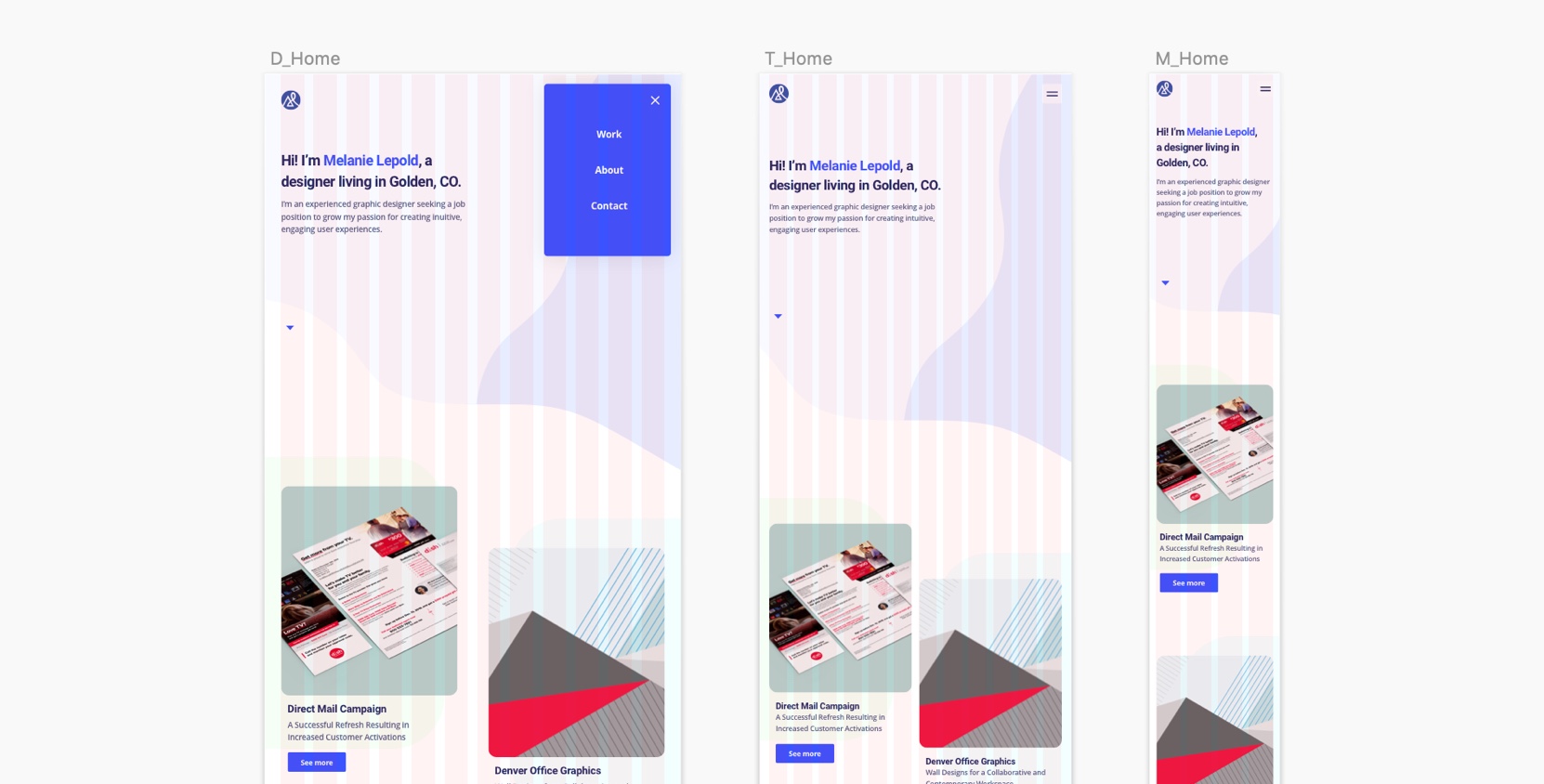
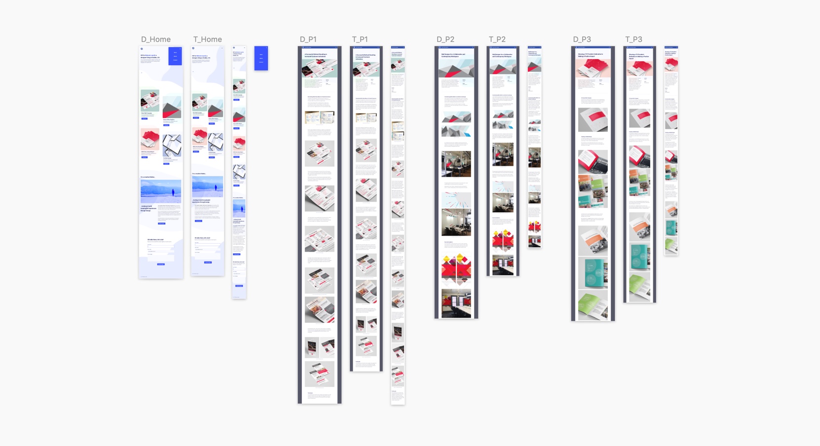
I designed each page at desktop, tablet, and mobile breakpoints. I used a grid that would make it easy to code for a responsive layout.
Colors
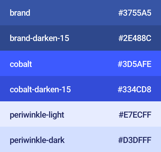
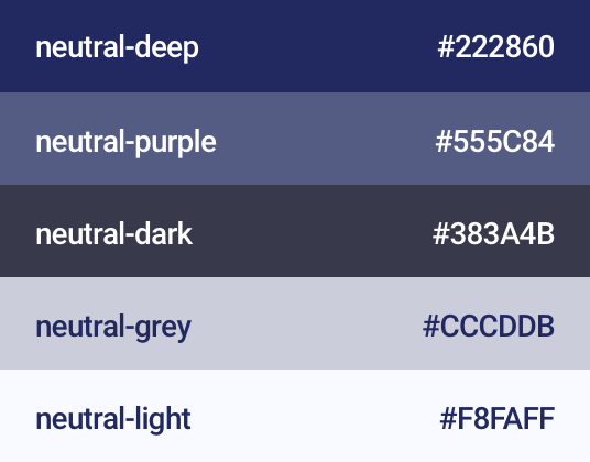
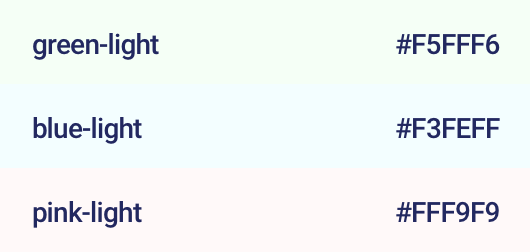
In a master Sketch file, I compiled all the colors used throughout the site. This helped to streamline development and make sure there weren’t any arbitrary colors.
While designing the site, I tested the accessibility of color combinations used for buttons and text, making sure to comply with AA standard contrast ratios.
Primary Colors
Neutral Colors
Supporting Colors
Buttons
I provided the designs for the different button states, including custom focus states. By designing the focus states with good contrast, they stand out from the rest of the content to provide a better experience for keyboard users.
Background Images
I created these vector background shapes to work with the webpage as it changes in size. As the width of the page grows or shrinks, more or less of the shape is revealed.

Development
I think open communication between designers and developers is important throughout the design process. This helps address any technical constraints or questions as early as possible. I used Zeplin as a tool for sharing my Sketch files and to give and receive feedback throughout the development process.
Designing for accessibility is also important to me. I used the WAVE Evaluation Tool to check for accessibility errors, and wrote alt text for all of the images. I also made sure the entire site could be navigated with a keyboard.
