A Successful Refresh Resulting in Increased Customer Activations
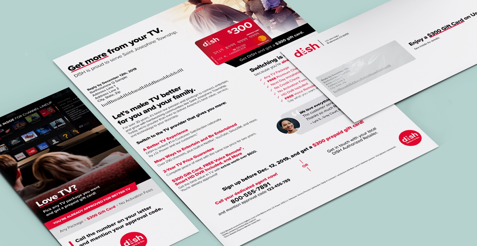
With an increase in DISH Network’s TV package pricing, this direct mail campaign needed a refresh to demonstrate the value of buying DISH over competitors with lower prices. The collaboration between our design team and the marketing team resulted in a 19% lift in customer activations when our new creative was tested against the existing champion creative.
Determining What Value Means to Potential Customers
Consisting of a two-page letter and two brochures contained in an envelope, the goal was to redesign the existing creative to better portray the value in DISH’s TV service to the rural target market.
The design team, consisting of the art director, senior copywriter, and myself, met with the marketing client to kick off the project. We then brainstormed how to incorporate the client's goals and marketing research into the copy and design strategy.
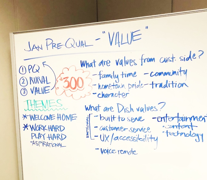
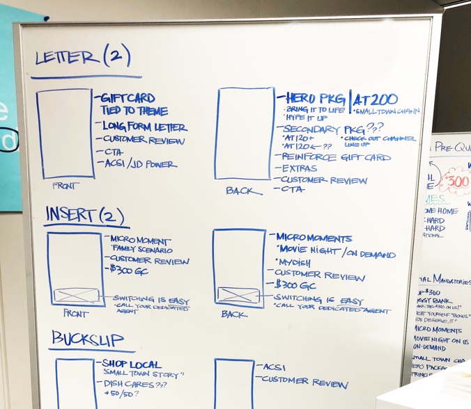
Notes from our brainstorm
After our copywriter finalized copy strategy, I worked on the visual design and content structure. Including everything in the set amount of space was challenging, but I enjoyed visualizing the information to be easy to comprehend.
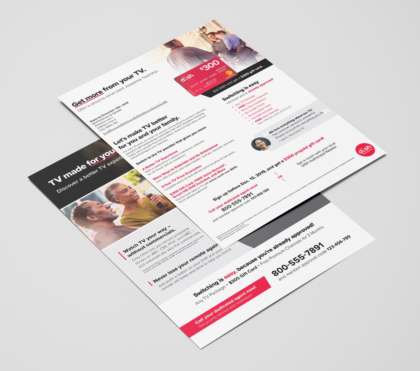
The front of the first letter page sets the tone for the rest of the creative and is an overview of the value the customer will receive when switching to DISH. I used bold headlines for easy scanning and highlighted important details with color.
While the gift card and other free extras portrayed the monetary value, it was important to show other benefits, such as award-winning customer service.
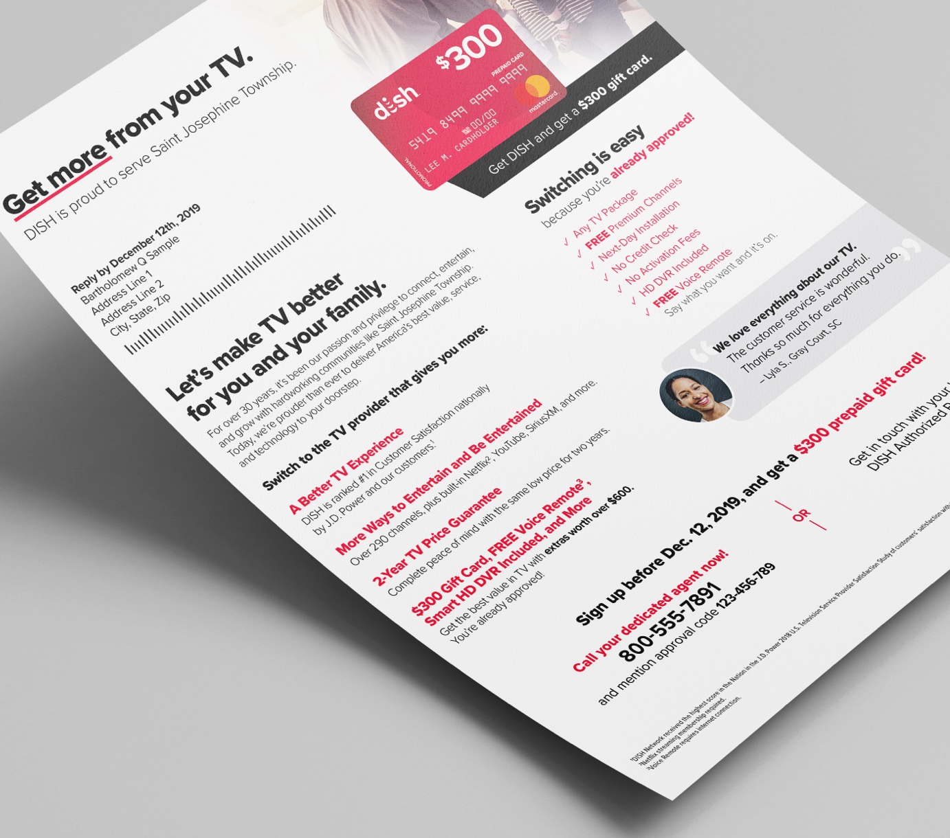
Front of the first letter page
To minimize the price increase, we included a section below to highlight the extras included with the package price. My design uses a simple grid to showcase them clearly.
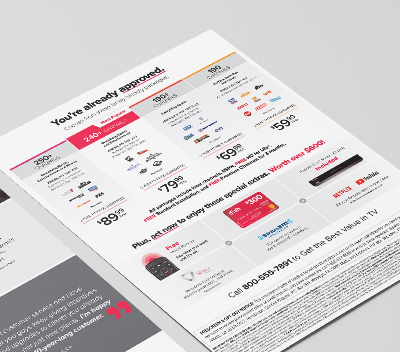
Back of the first letter page
The design of the second letter page focuses on “value stories”, which our team developed using existing marketing research to elaborate on the specific features most relatable to the customer. To make it more engaging to the viewer, I used relevant lifestyle imagery and prominent customer reviews.
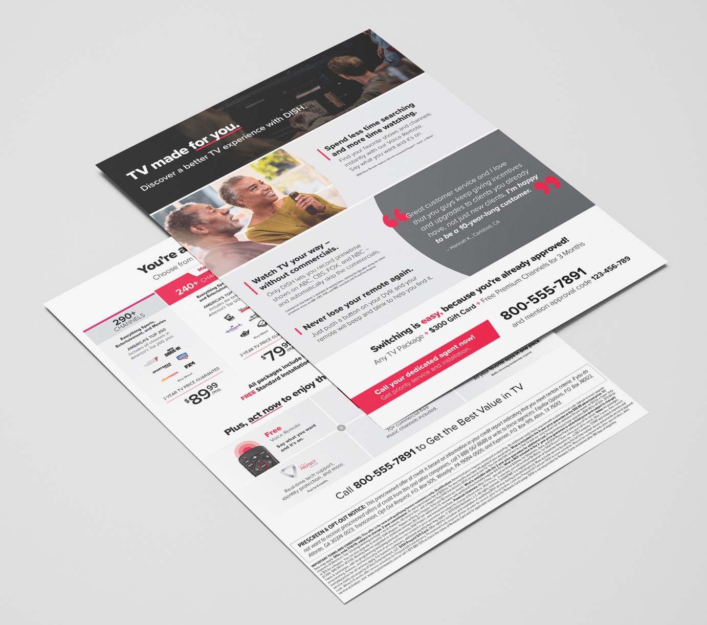
Front of the second letter page overlaying the first letter
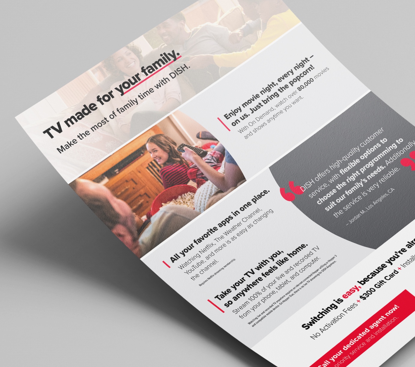
Back of the second letter page
The bifold brochure has a channel list for all the packages and highlights the free voice remote. The double-sided brochure goes into more detail on customer service and highlighting DISH authorized retailers in local communities.
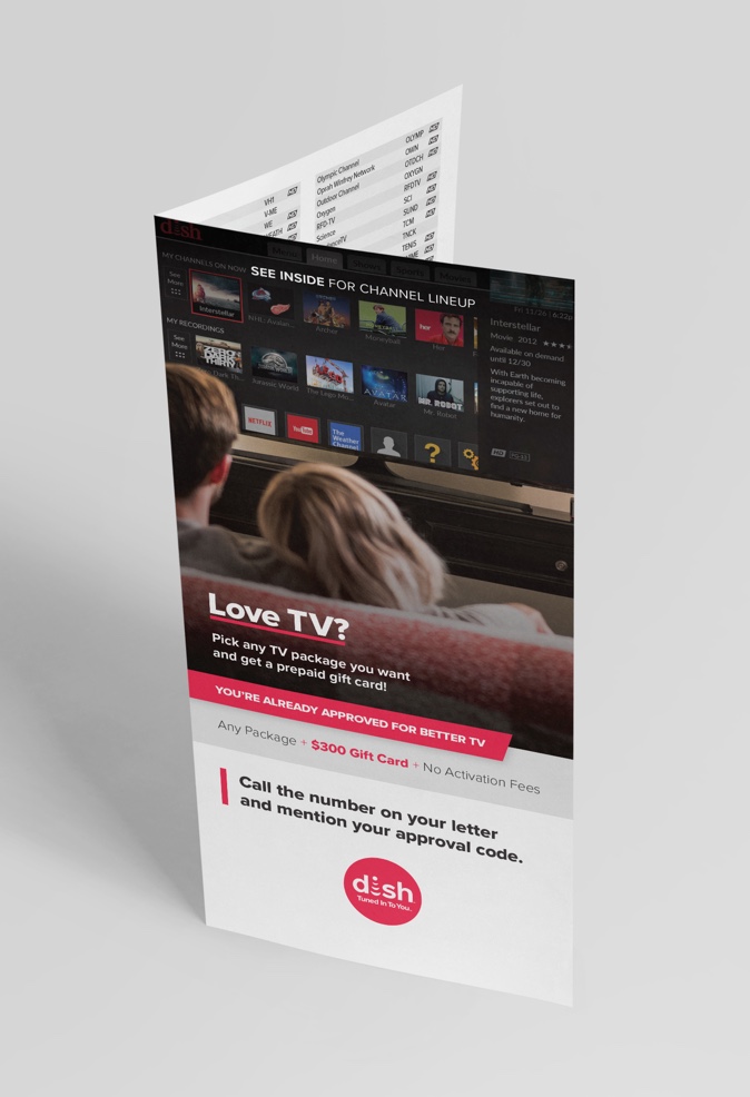
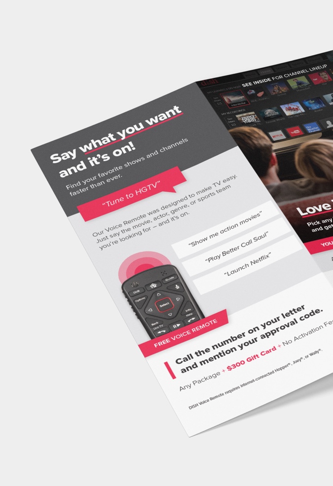
3.5”x6.75” bifold brochure
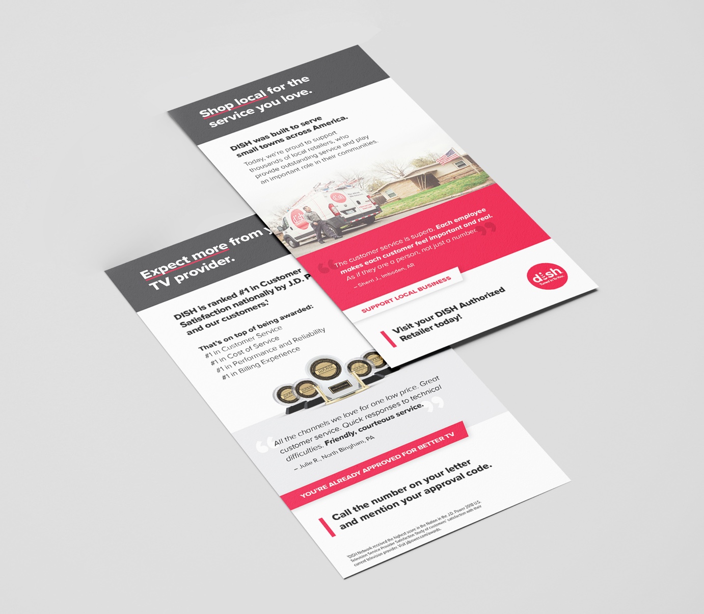
3.5”x6.75” double-sided brochure
The Results
The marketing team tested this new campaign creative against the current champion in market. Our new design and strategy performed better, increasing customer activations by 19%. It became the new champion creative moving forward.